ASTP Templates
Topic and Subtopic Template Design
ONC’s website is made up of Topic Pages with children subtopic pages. Refreshing the design of these pages was critical for the user experience in the updated HealthIT.gov website.
A Bold Refresh Aimed at Content Exploration
The Updated Experience
The video below demonstrates the updated Certification topic page redesign. Notice the updated subnav where a user can explore the subtopics. The hero zone in this instance uses an optional variant that includes a collapsible “key links” menu.
✴
Breadcrumbs are designed in a more meaningful way – active page is not a link because you’re on that page.
✴
Button group in hero zone consists of a primary button and secondary button creating separation and emphasizes the main CTA.
✴
White space has been increased between site components which improves readability and visual hierarchy.
The Problem
A look at the old topic and subtopic designs
Before the redesign, the topic pages looked okay from a design perspective although it had some issues:

Subtopic pages had their issues too
The parent topic pages (seen above) have several subtopic pages, a way to navigate through the subpages was important. Throwing all of those subtopic pages would overwhelm the main navigation. Notice in the topic page above there is a “Explore Subtopics” directly below the hero zone. The problem is that this was implemented as a jumpnav within that page. Notice in the subtopic below, the left hand side lists out all of the subtopic pages, this cluttered the design and squeezed the main content.

User Testing
Using Maze and Figma to Run User Tests to Answer Internal Questions
The question arose whether or not the subnav should be directly under the navigation or if it should stay on the left side which was a common government website pattern found in USWDS.
The team and I used Figma to prototype different user flows of navigating topic to subtopic pages and connected it to Maze’s user testing platform. We wanted to know if the subnav directly below the main nav (left hand side in image below) was intuitive. The idea was that a user could navigate through subtopics directly related to that topic. The previous design with the navigation on the left (image on the right below) in conjunction with our “On This Page” side nav which was meant to guide the user through the content on the current page created a cluttered and confusing layout and we wanted to confirm that hypothesis.
Our tests confirmed our hypothesis and users preferred the direction we eventually adopted.

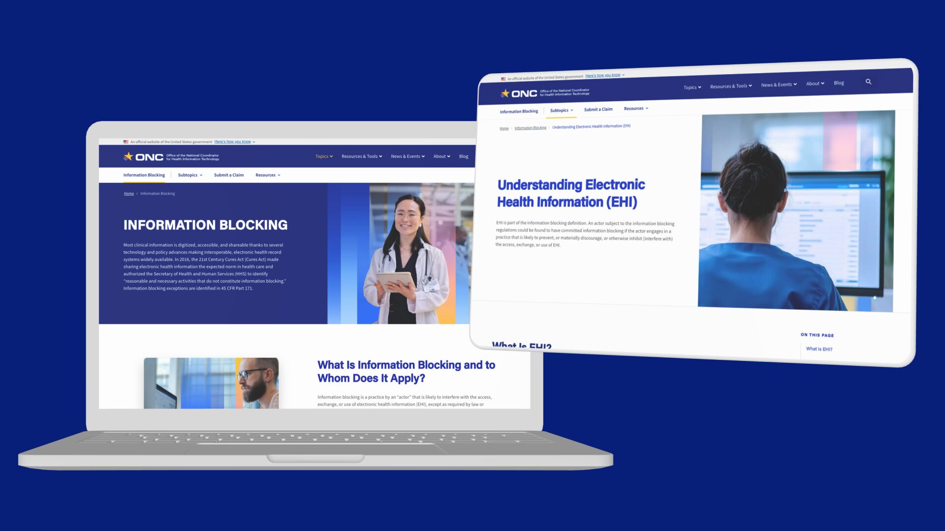
A Closer Look at the Updates
A look at the updated topic and subtopic designs
Below is a look at some annotated sections of the Information Blocking page (click here to to visit the live site).

Solution for When Subnav Menu Becomes too Wide
With Health IT’s updated subnav menu design, the idea was to have the most popular items appear first. There were instances where the amount of subnav items became large and on smaller screen sizes the menu would be wider than the viewport. After brainstorming some ideas like scrolling and pagination, we came up with the solution seen below. A “More” button appears which once clicked, displayed that topic’s entire sitemap of pages.

Wireframes
A key part of the redesign is iterating on wireframes. Below is a glimpse at some of the wireframe screens. My process involves rapid iteration and exploration of different directions. The next step may included combing different directions or further explorations until a solid direction is agreed upon. If necessary, user testing is also explored.

What I Learned
Updating the look and feel of the topic and subtopic page was a super important part of the redesigned HealthIT.gov website, the patterns in these template was used on a majority of the site’s pages. I am happy with the result, please take a moment to click through the site to see the topic and subtopic pages in action!
To view this site live, please click here.